De Lijn
User interfaces that close like a bus
De Lijn needs no introduction. This transport company has provided Flanders with bus and tram connections since time immemorial.
The Project
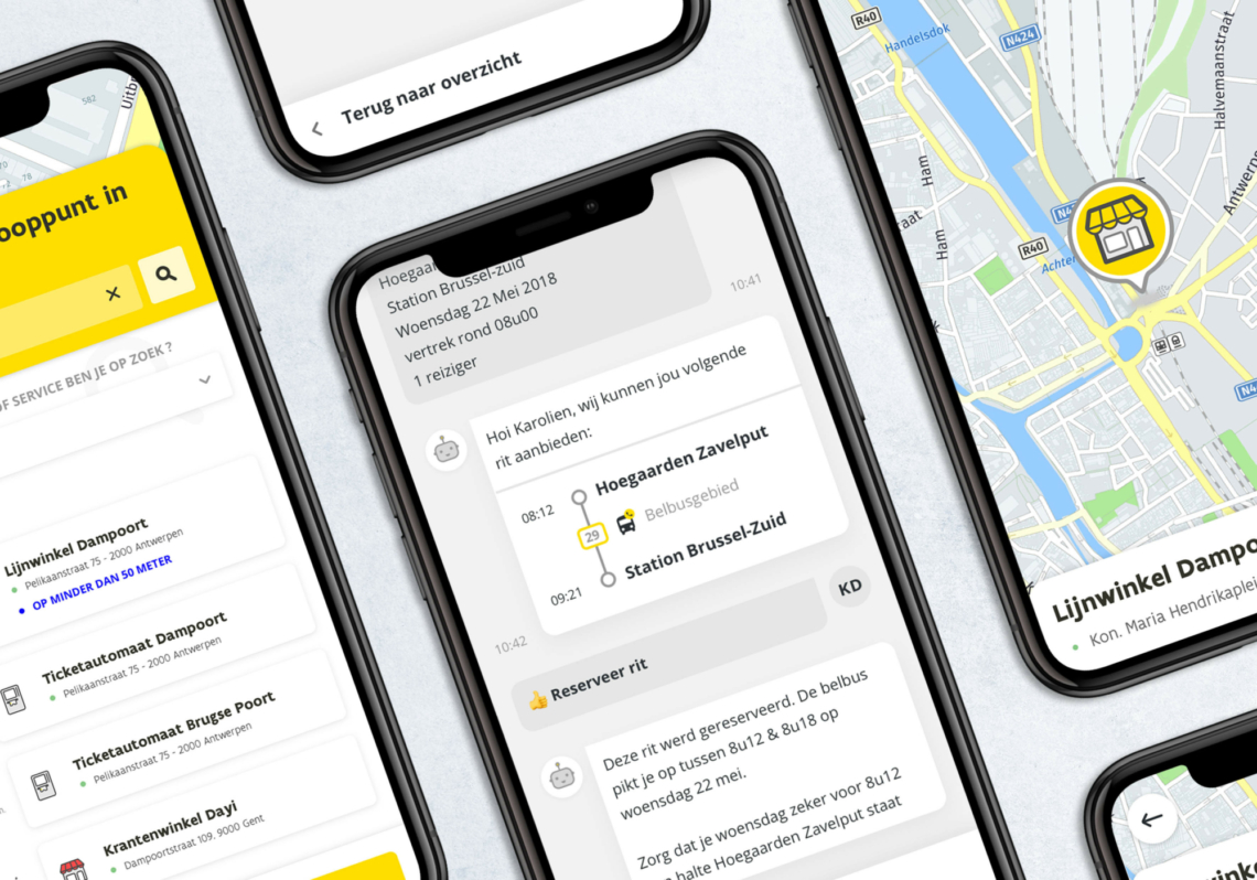
Imagine: you have to move into or into the city, but you already see the traffic jam. Just the tram? You can check your route via the route planner on the website. That looks ok! You rush to the tram stop, but you're just too late. Fortunately, with the real-time info at the stop, you can see that the next tram will be there in five minutes. Great, that gives you just enough time to buy a ticket online and forward your arrival time to your appointment.
You don't think twice at that moment, but there is a lot of innovation and advanced development behind the applications of public transport. De Lijn has been striving for years to provide an optimal user experience for its customers. A few years ago, the transport company called for a UX/UI designer, and Unikoo came out on top.
Originally, the intention was to visually adapt De Lijn's website, but many opportunities for improvement soon surfaced. The team expanded and thoroughly overhauled the entire website: what was needed? And what was this supposed to look like exactly? This is how De Lijn came up with an advanced, modular system that focuses on the user journey. Each stop, address, municipality and street also received a separate data entity for improved route planning. Soon you will be able to enjoy the best De Lijn website experience so far!
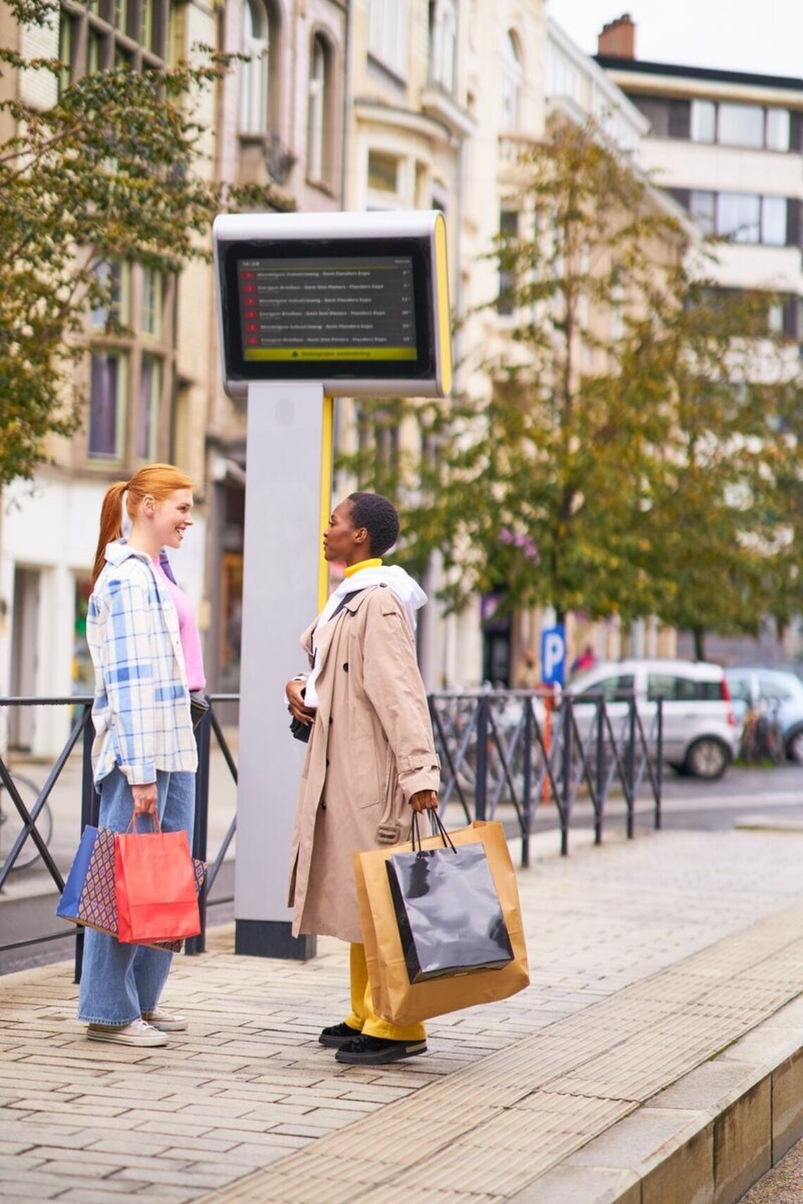
But the website is one thing. There are so many more options for sharing traveler information. For example, our designer also took care of the real-time information boards at stops and stations. The result can now be seen live everywhere and seems rather basic, but the simpler the design, the harder it often is to design it. After all, the space and opportunities are very limited, but a lot of information needs to be provided. Can we display colors at all? Is a top need a plate to explain the info? What is the clearest way to display the information?
Research is key here: is' 5 'sufficient, or is '5 min' clearer to indicate that the tram will arrive in 5 minutes? Does all the information have to be on one image, or can a scrolling screen offer a solution to provide more information? It is important to know how the final user reads these boards, because this is the only way to get an optimal design.
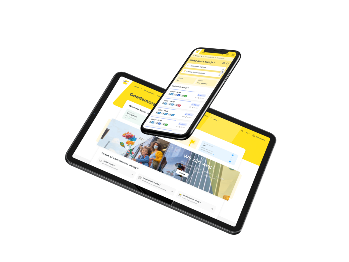
B2B, De Lijn also focused on ease of use for its customers. That's why they wanted to develop a user-friendly portal where employers can manage their employees' subscriptions. Our UX/UI talent led this project: from idea and requirements to user flows, an appropriate design and, of course, optimization based on user feedback.
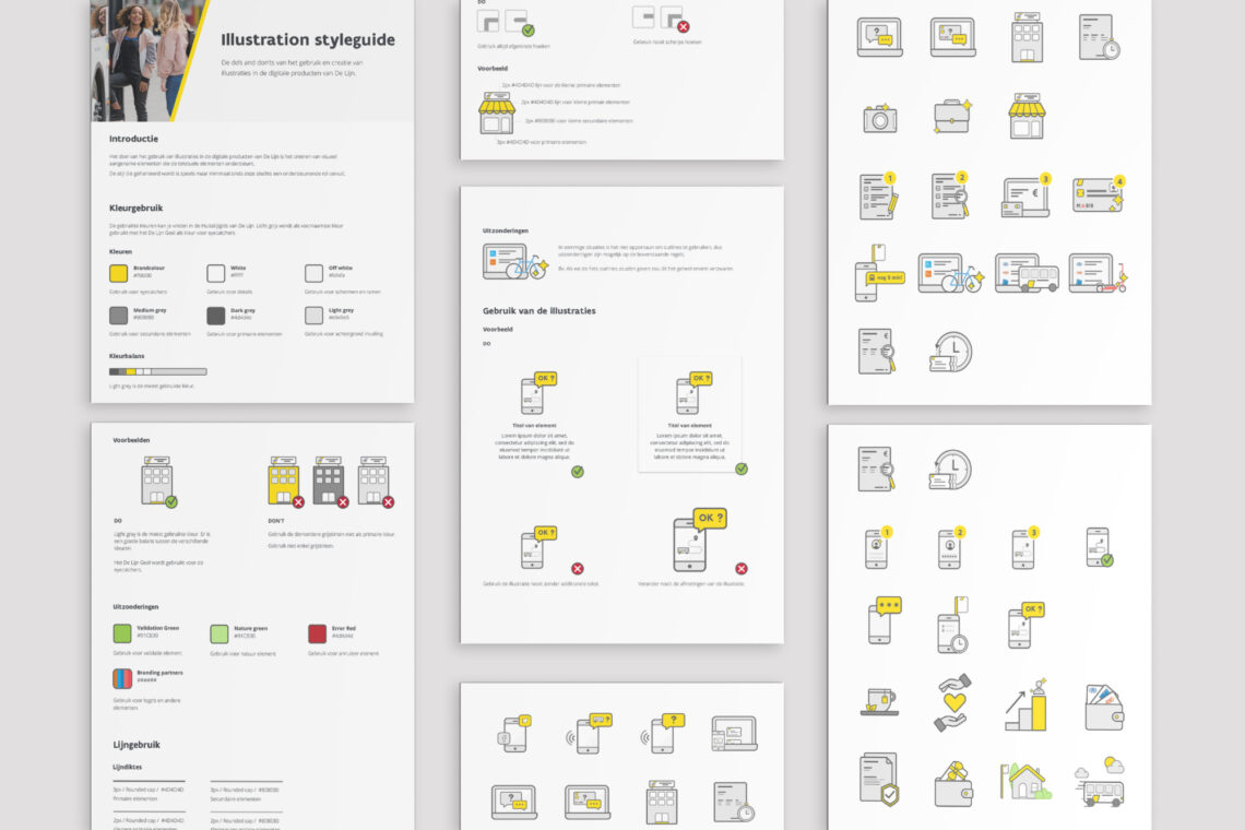
As you can see: a lot to design and various designers who have to work on the assignments. That is why it is important that the designs are all nicely coordinated. For that reason, our designer also worked on a style-stickloud. She designed various icons, put together a color set, chose the typography, and even defined possible surfaces. The ideal guide to a coherent brand experience.
Do you also need beautiful designs, adapted to your customer needs? Take contact join us, our UX/UI designer would love to meet you!


